Chrome Marketing Page Redesign | 10 year Anniversary
This redesign aimed to elevate the v1 design to a brand-compliant experience with the new Chrome product messaging and positioning. The marketing team wanted it to be “Googley” yet “also different.”
Our goal was simple:
Make people care about the amazing thing they’ve been taking for granted.
We needed to communicate:
Emotional outcome (Feel)
Generate love for Chrome’s brand, grounded in the product truth.
Rational outcome (Think)
…So our users prefer our browser over the competition…
Action outcome (Do)
…and actively choose to install and use Google Chrome. And recommend it…
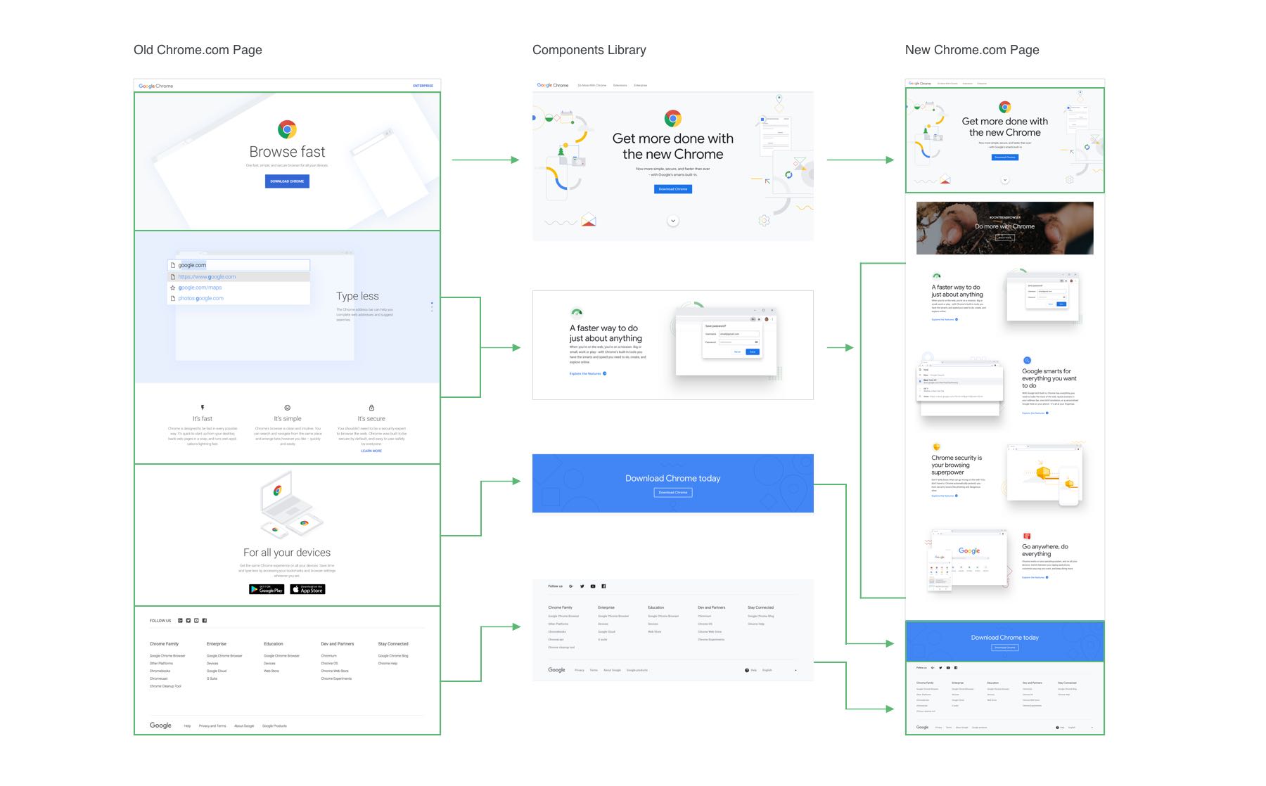
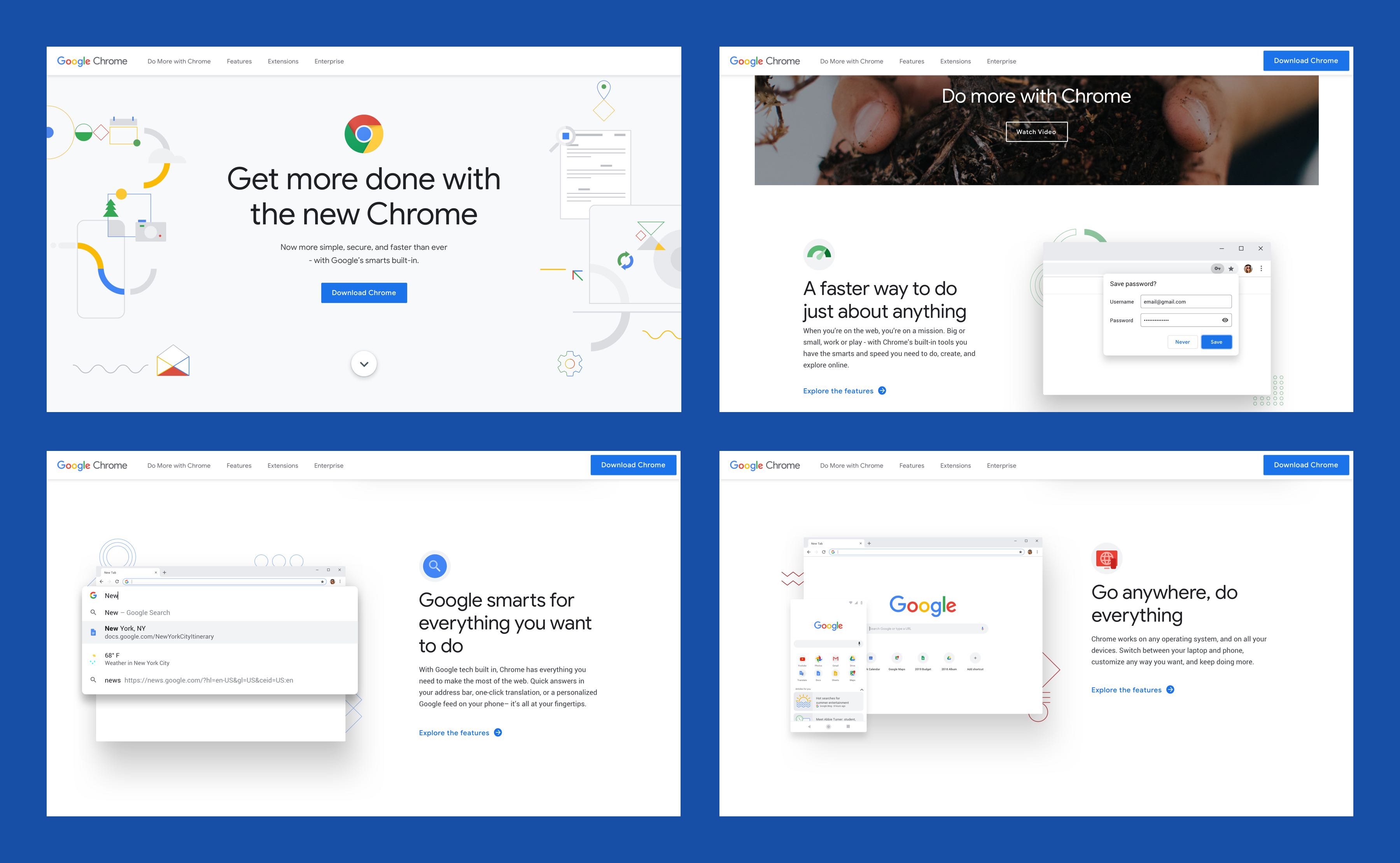
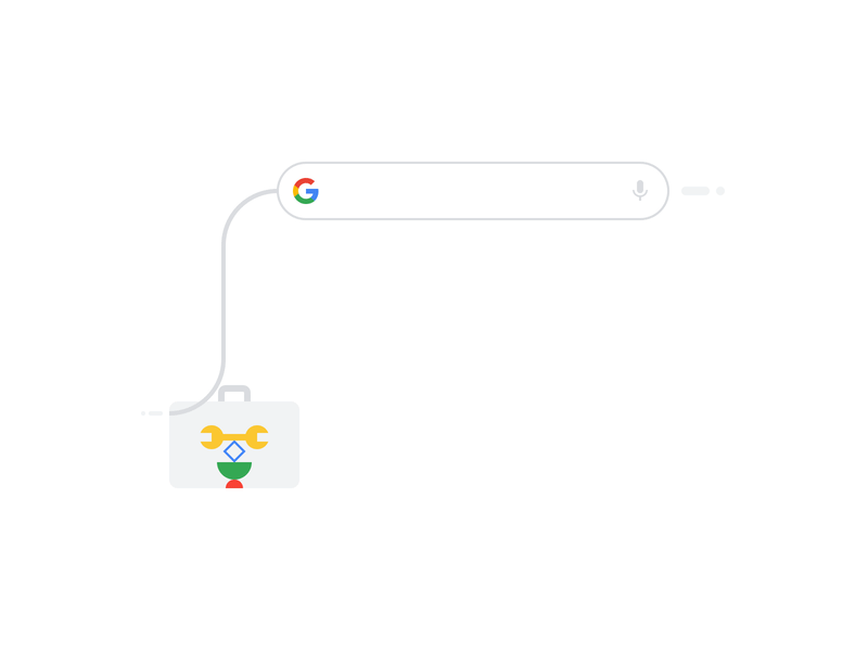
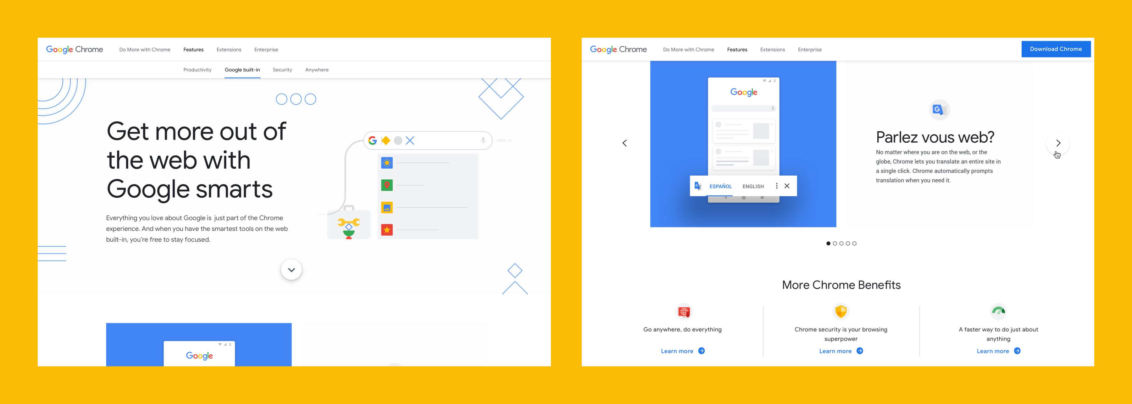
We initially proposed abstracting as many concepts as possible to primary colors and shapes to communicate ideas instead of only showing screenshots. We landed somewhere in the middle, and here is the result. It is playful and friendly, clean, and concise. We wanted to create an experience that closely follows the browser's visual language: simple, subtle shadows for emphasis and flat geometric accents.
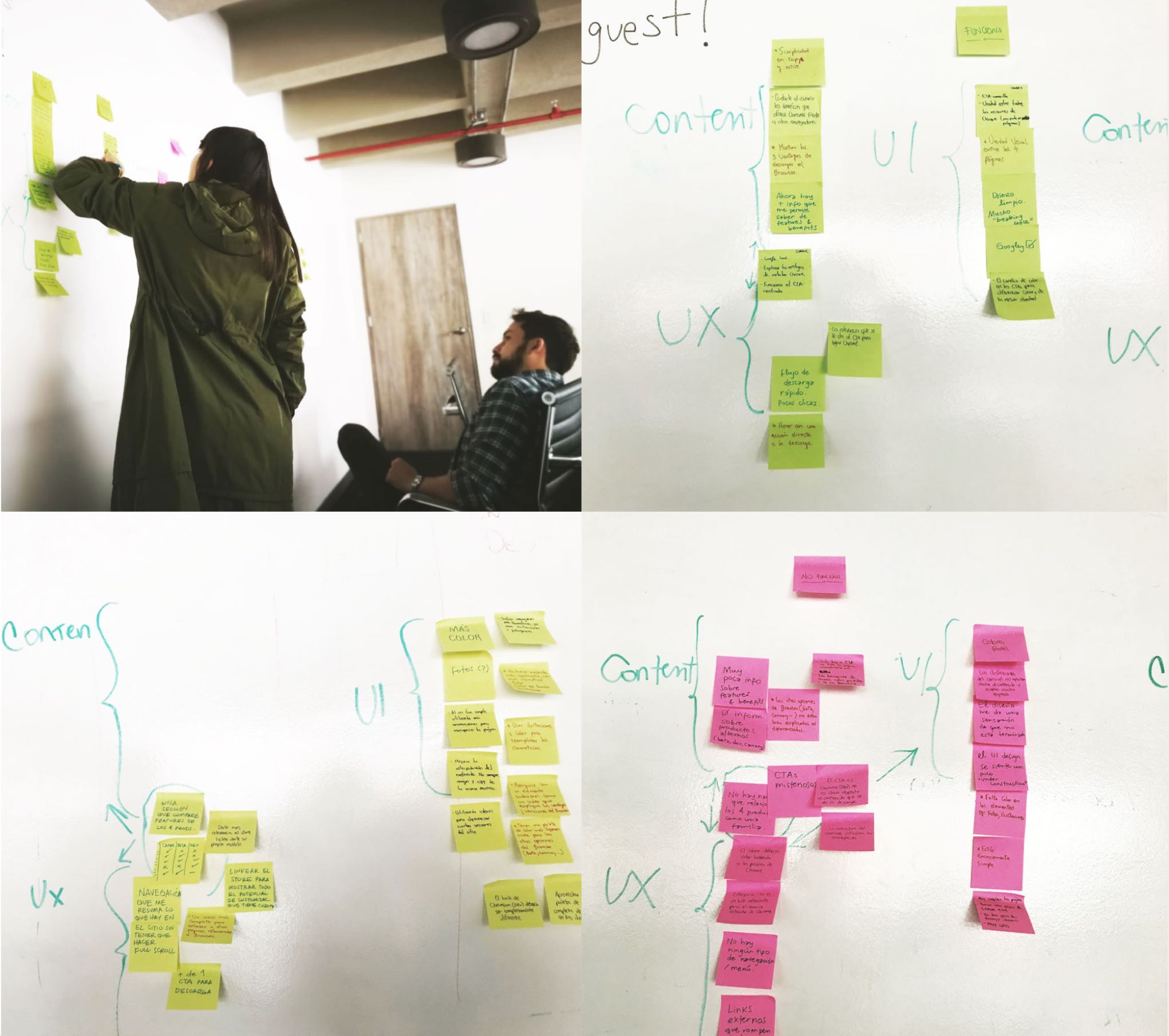
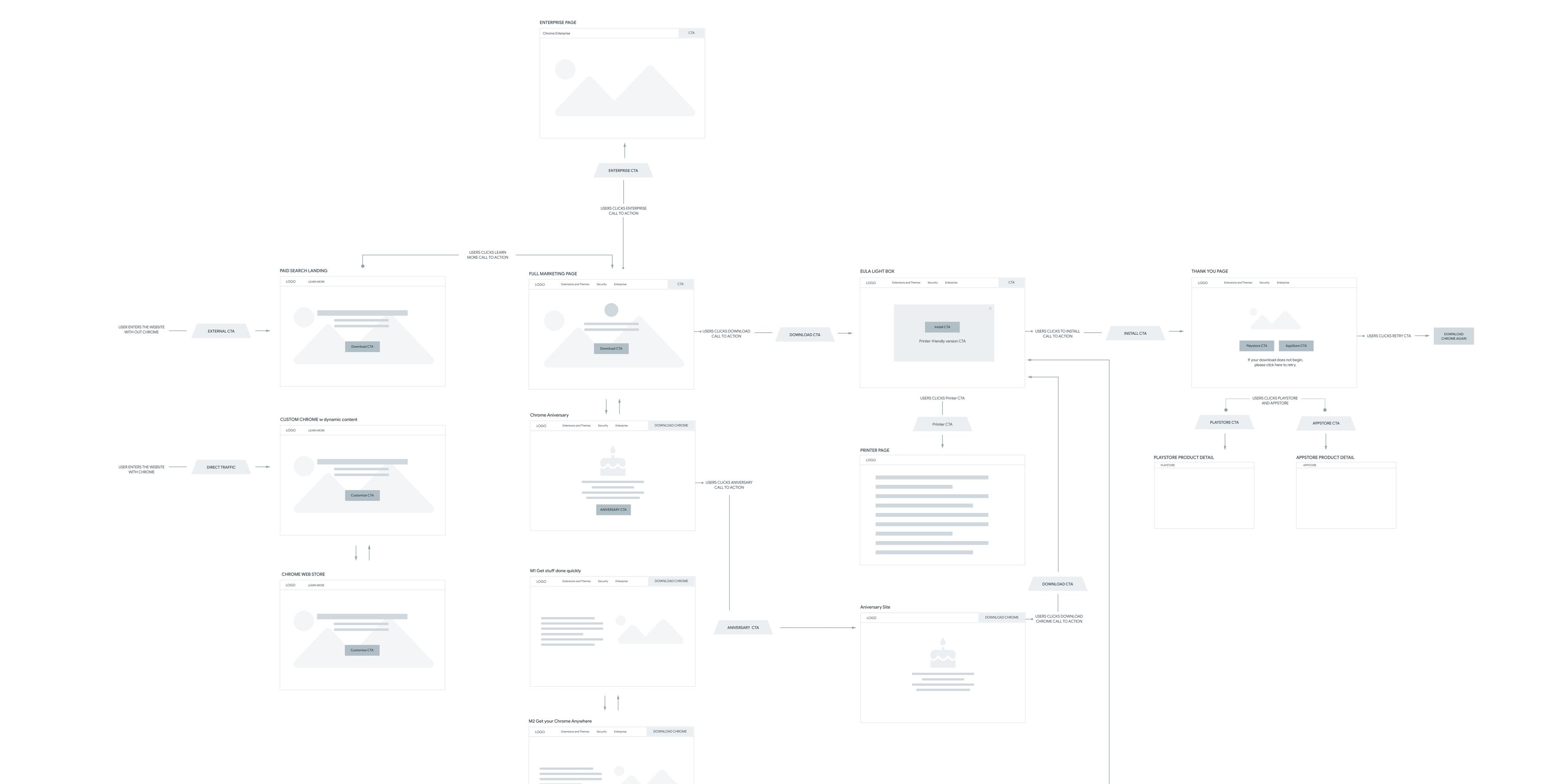
After we had the brainstorming result, we started to create a user flow to describe the steps that the users take to access a function or perform a task on the site.
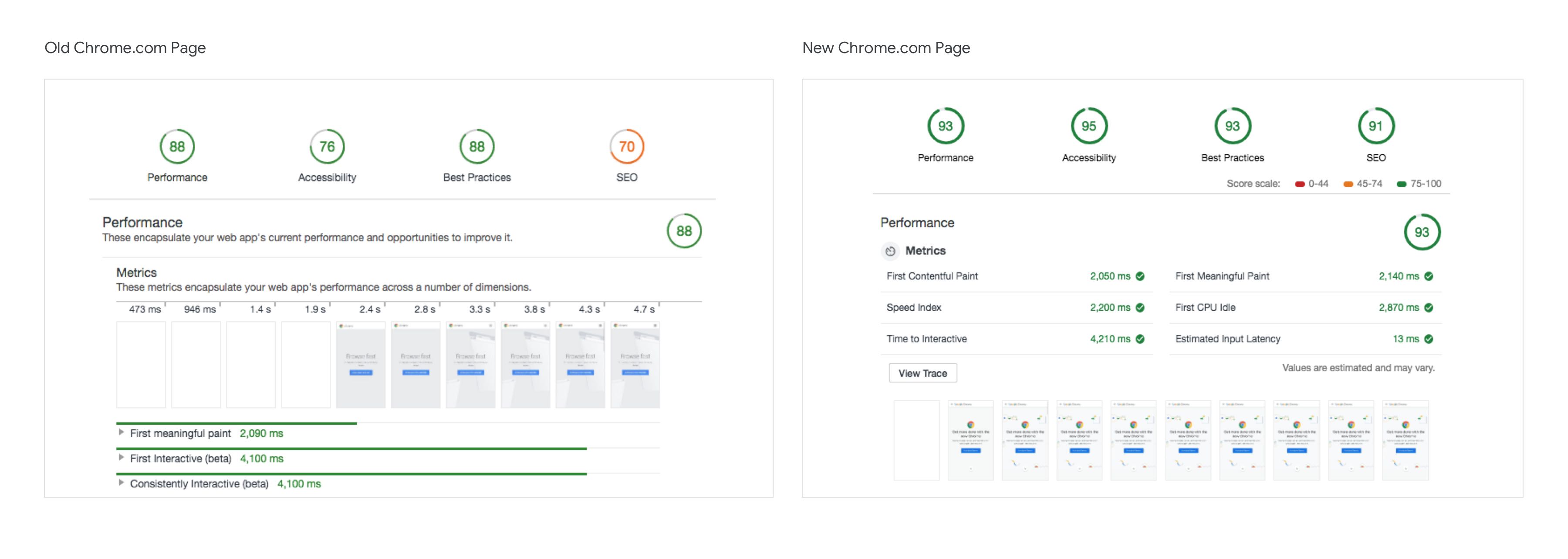
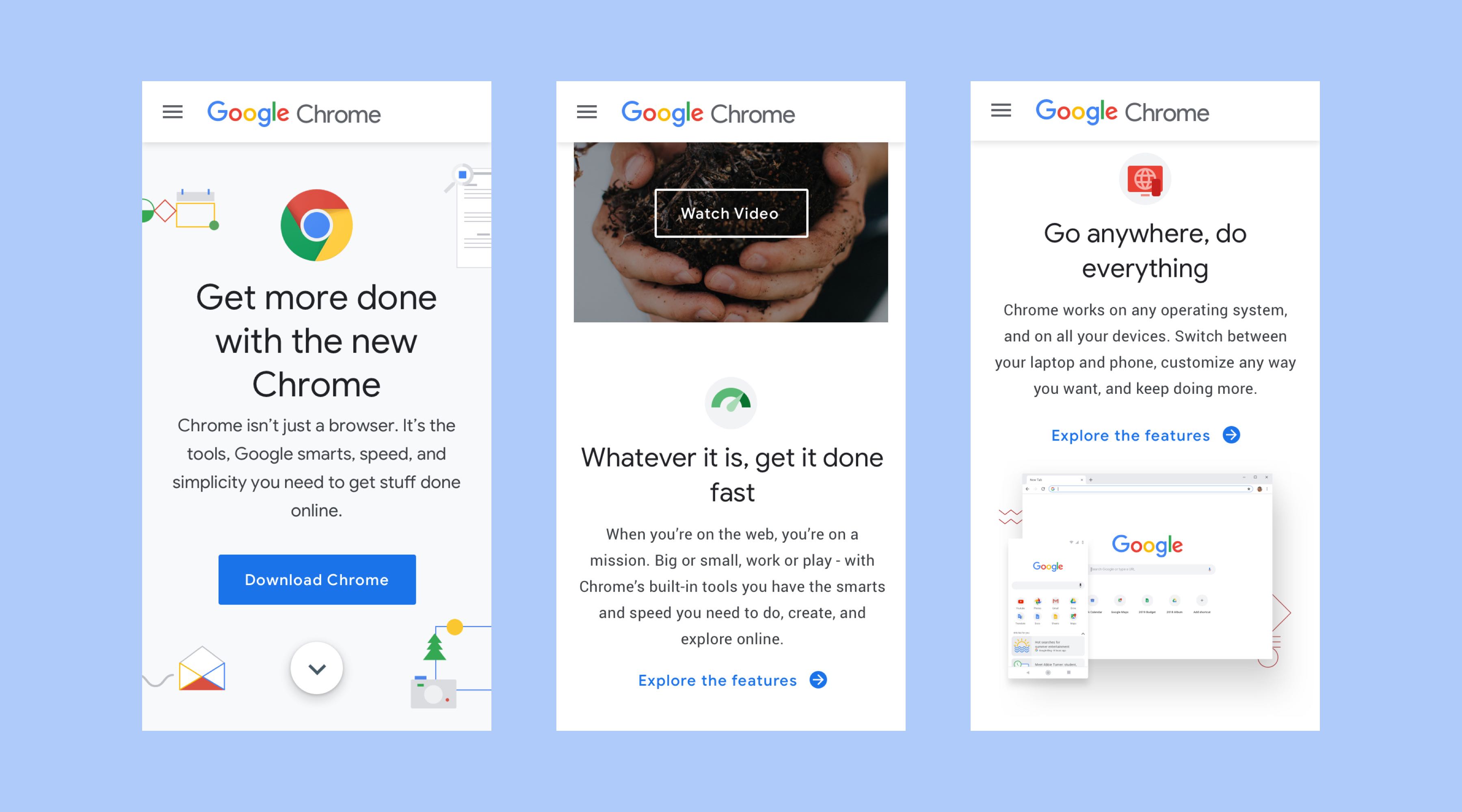
Many platform-specific features were implemented and perfected for this version, such as adding the feature pages, the new menu, and some animations.
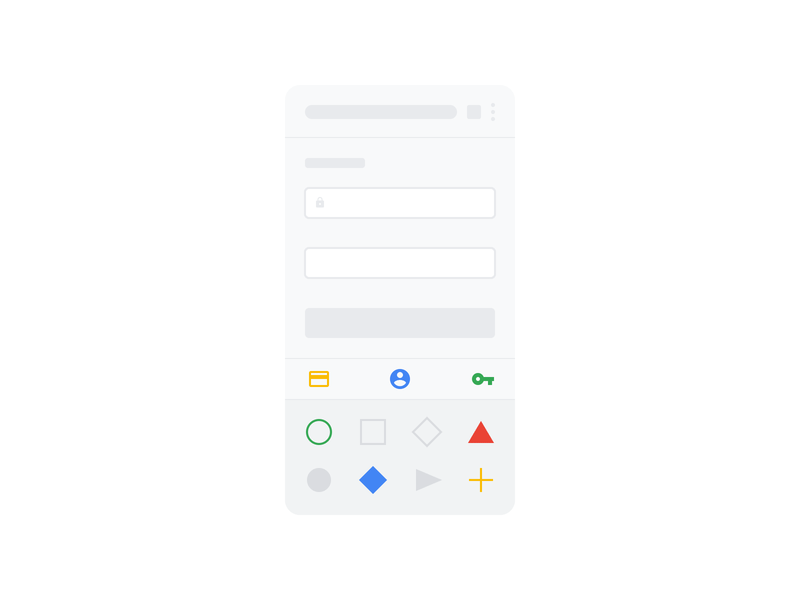

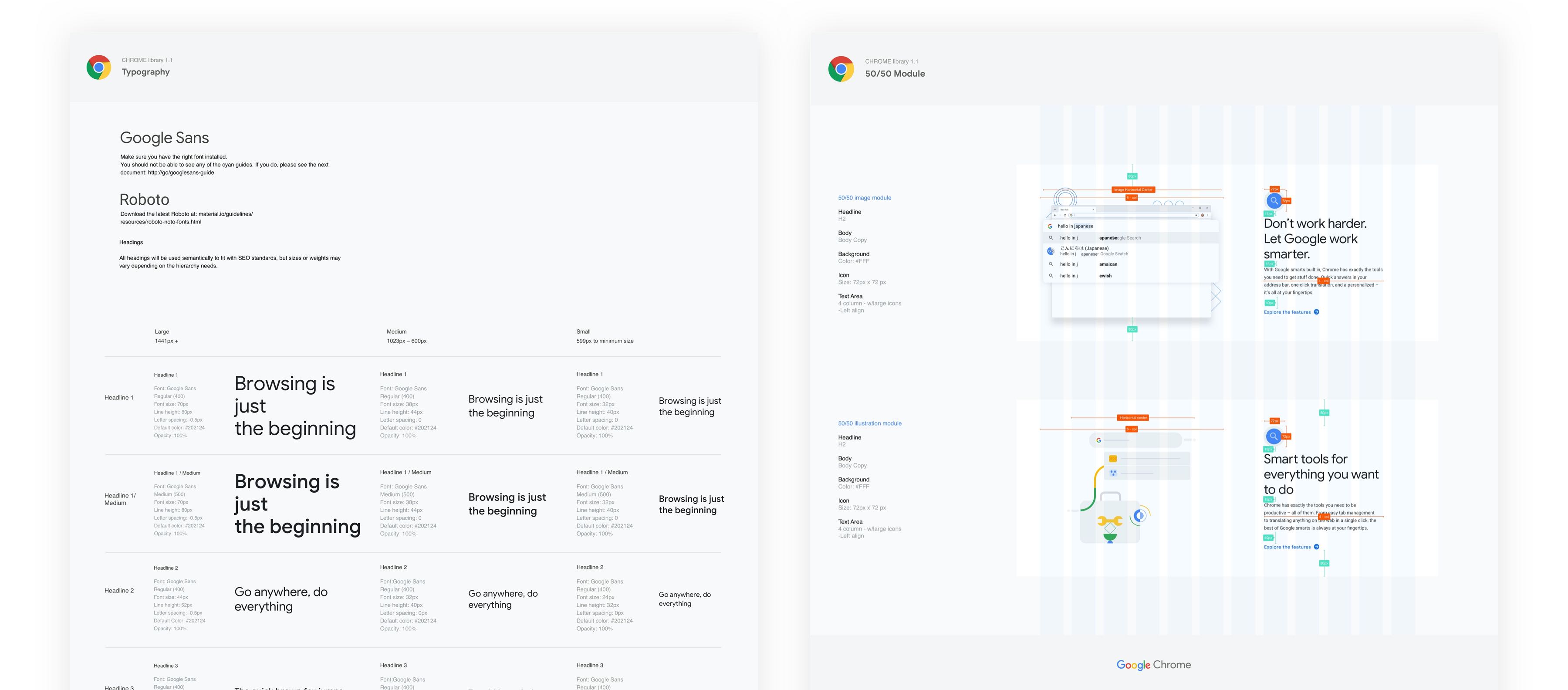
We also created a design system to organize all the components with their specs to improve our hand-off process to the dev and QA team.