Chronicle, the new way of seeing Cybersecurity.

Project Overview

Chronicle was born in 2016 as a project within X, Alphabet’s moonshot factory. They want to give organizations a much higher-resolution view of their security situation and help them to protect themselves.

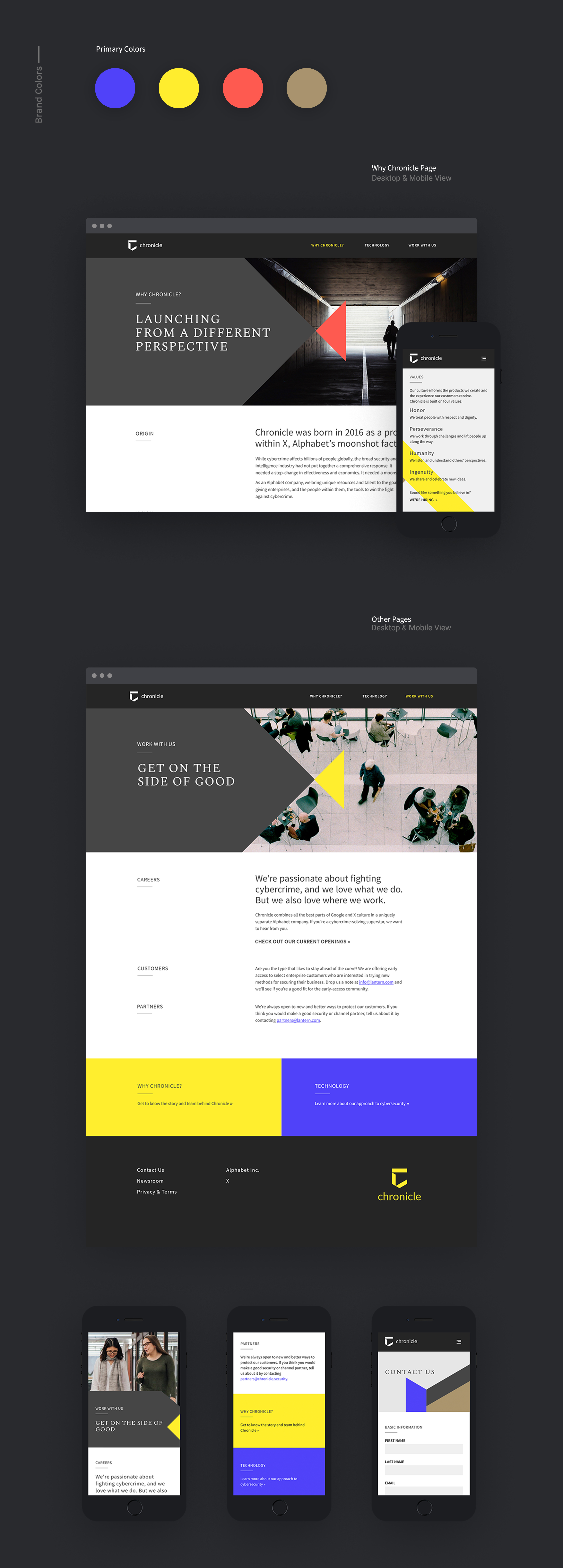
Our challenge was to build a responsive website utilizing the Chronicle’s brand guidelines and company values: humanity, honor, perseverance, humanity, and ingenuity.

They wanted to look like an independent product distinct from the Google brand and be a user-friendly web page than most security sites.

We had a very tight timeline, just one week to build the concept and to design the homepage.
Client
Google X.
Agency
Factor SF + Huge Inc.
Embedded with Google.
My Role
Visual Designer.
Creative Team
Amy Ni Pan, creative director.
Emily Luedecke, copywriter.
Project State
Launched 2018.

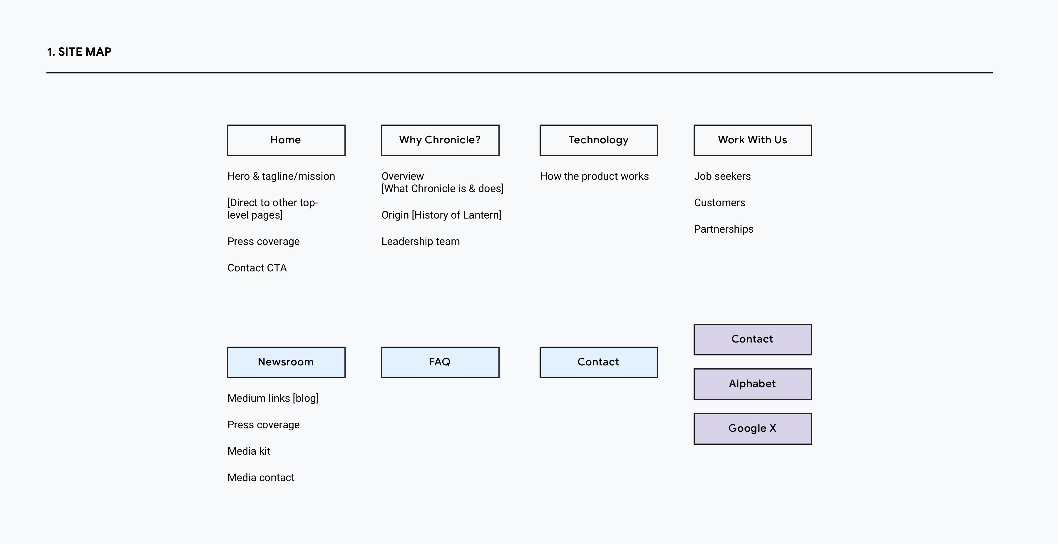
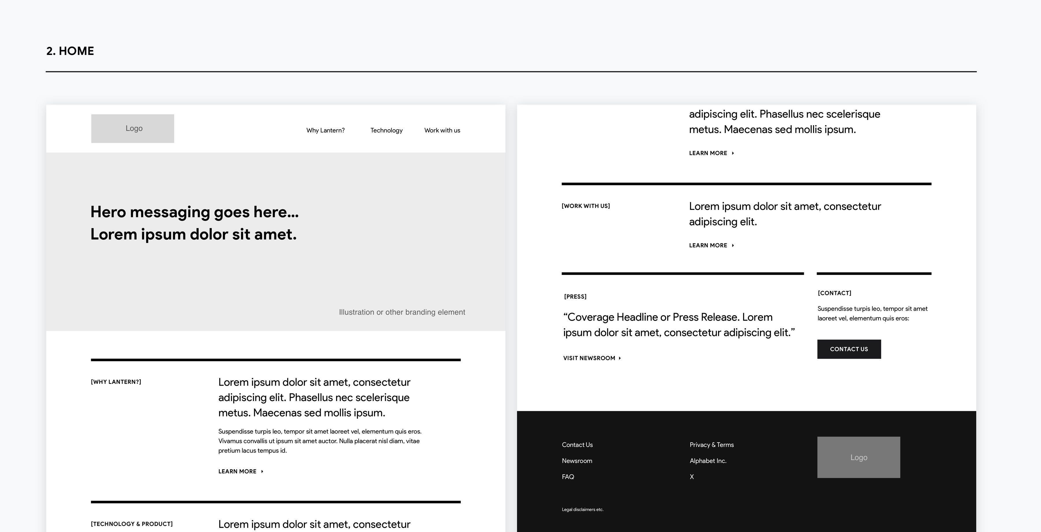
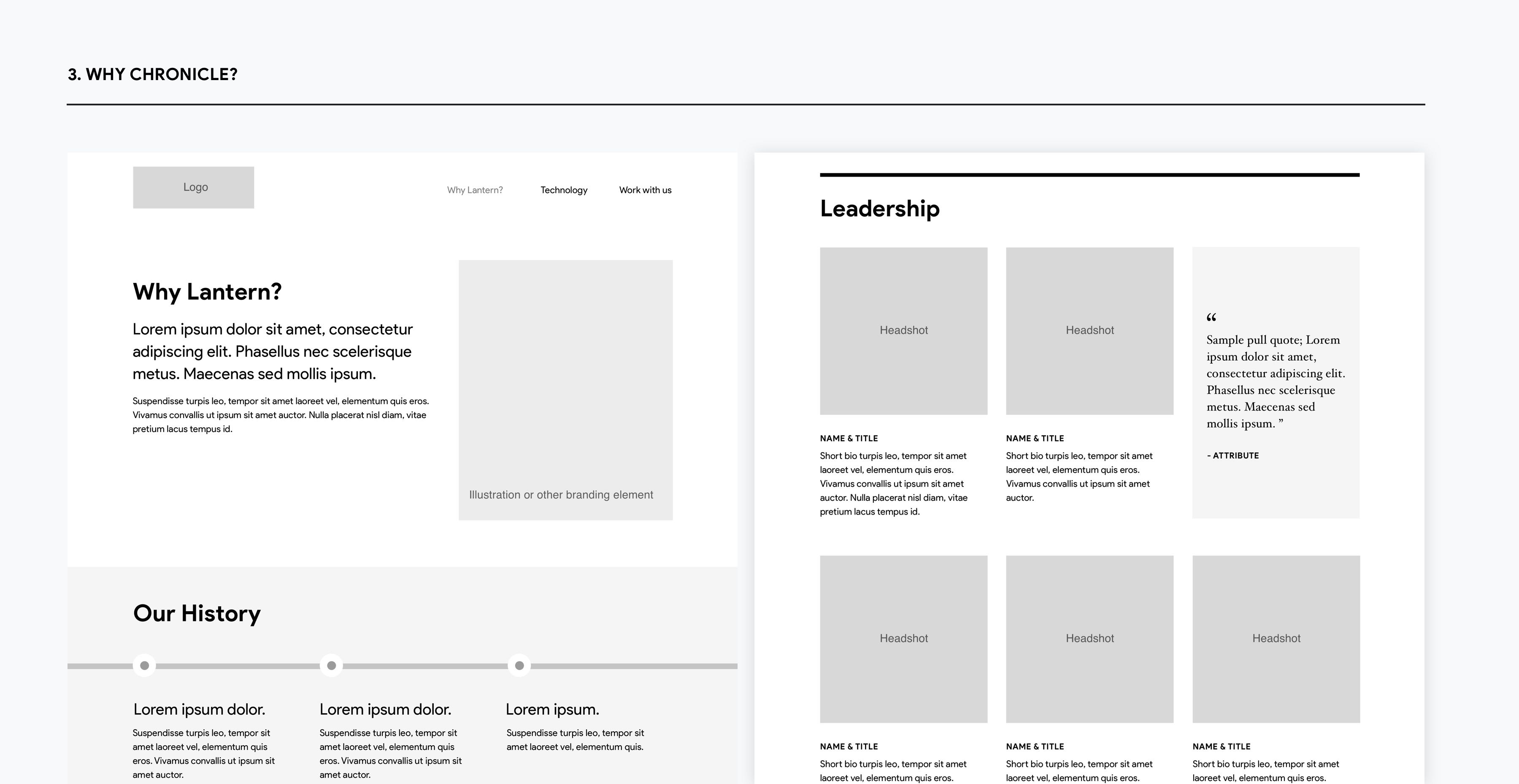
For the wireframes definition, one of my colleagues started to organize the architecture information of the site; the main idea for this site was to showcase editorially all the services that the company was offering by creating a modular system.
Considering that we didn't have much time, we started to explore diverse concepts for the page's visual language. Having in mind that the client wanted a different language for his brand, we added the four main colors of the identity, and we selected the brand typography and started to built the visual language of the page.