A Master Figma Library for Assistant Home Display.
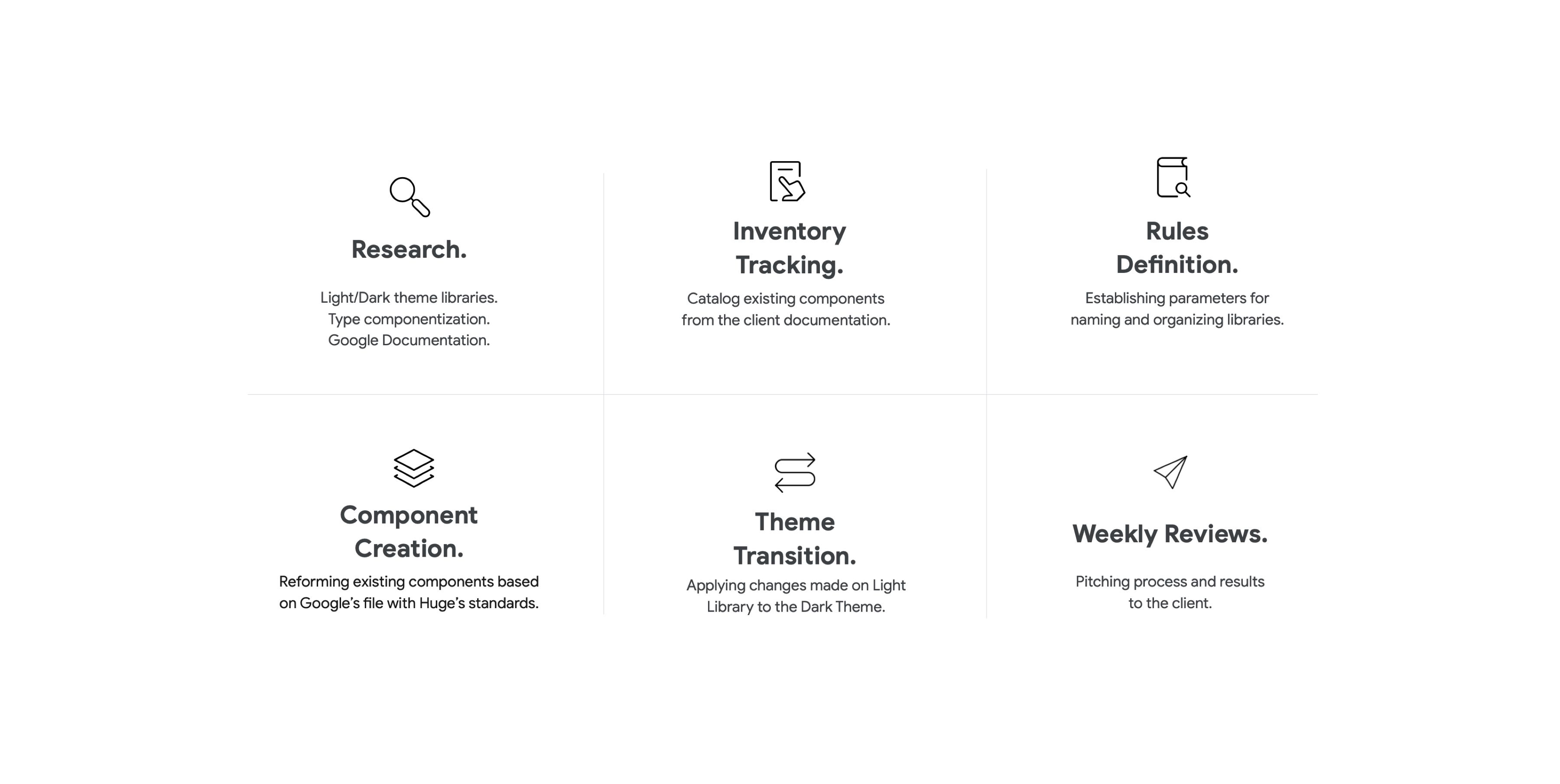
The first thing we did, was established a straightforward process to understand the product and create different ideas of an organization that works well for a big team like Assistant Home display.
Part of the work required for Asst. SS conversion requires research to validate the decisions we are taking and determine the best way to move forward.
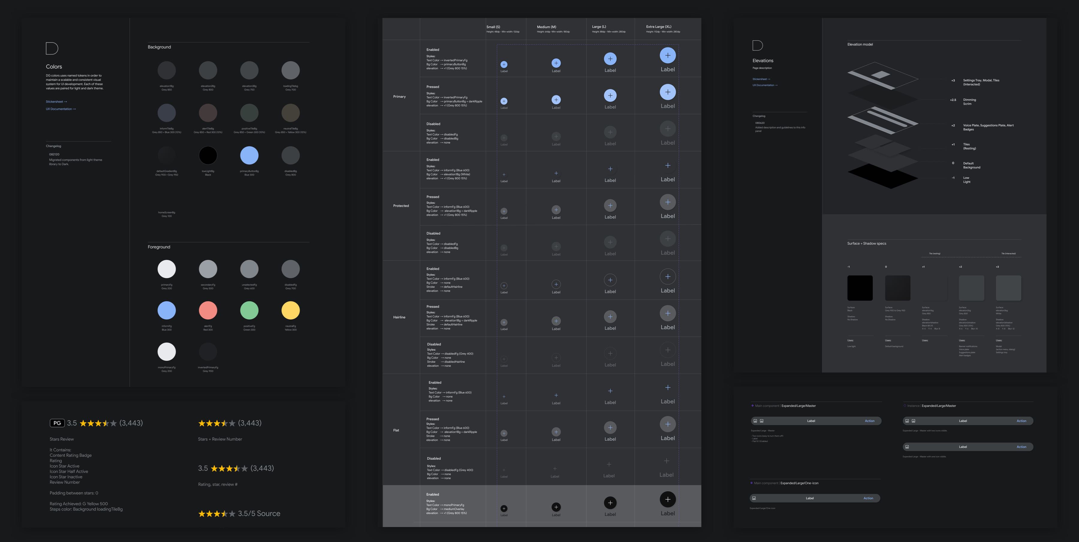
After having an exact process, we started to create the light mode library first. In this file, we organized the content by building blocks components, making work as a Lego.
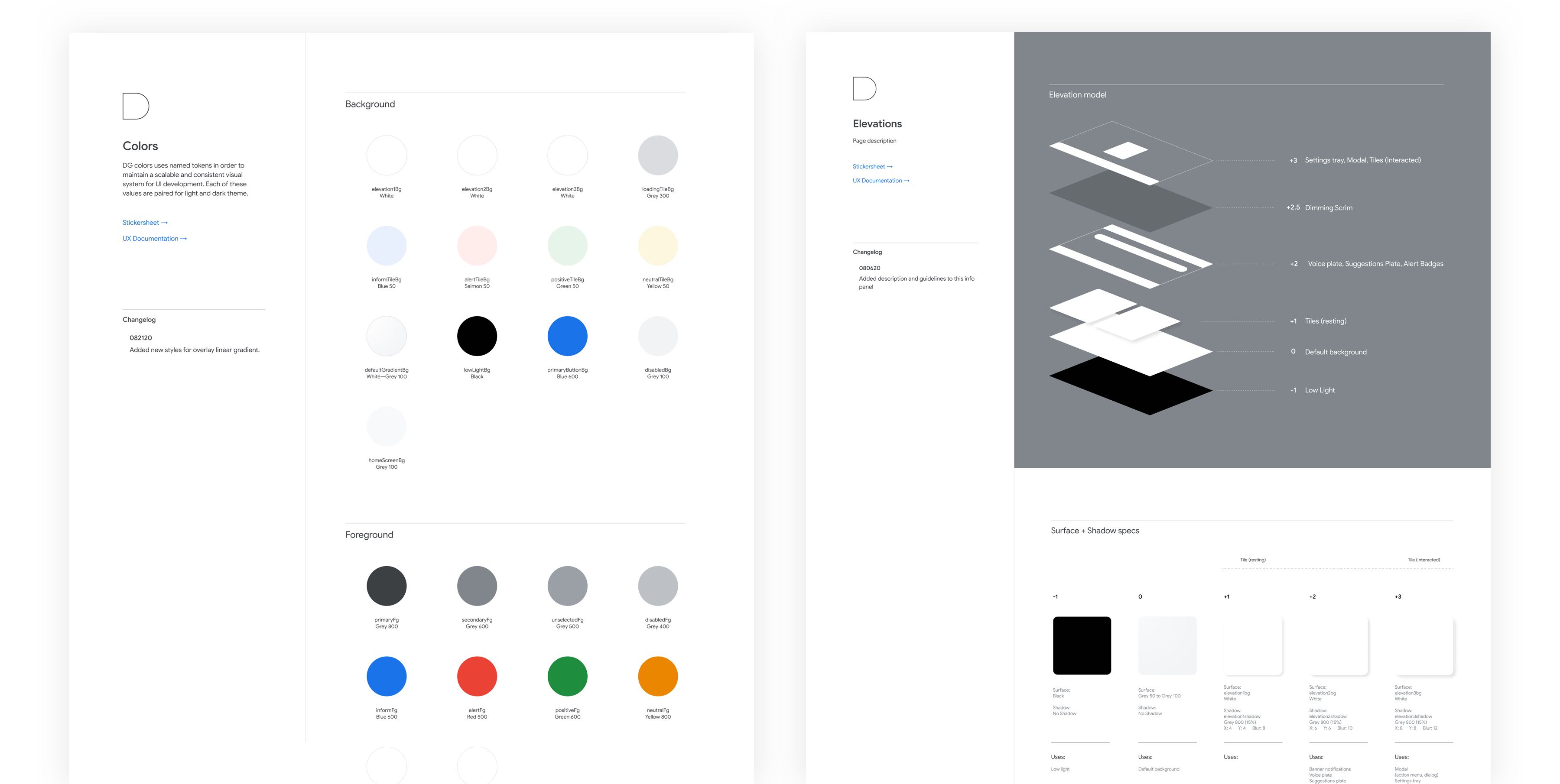
Firstly, we defined the document's foundations, and then we created the block, this way, it is easier to change a style.
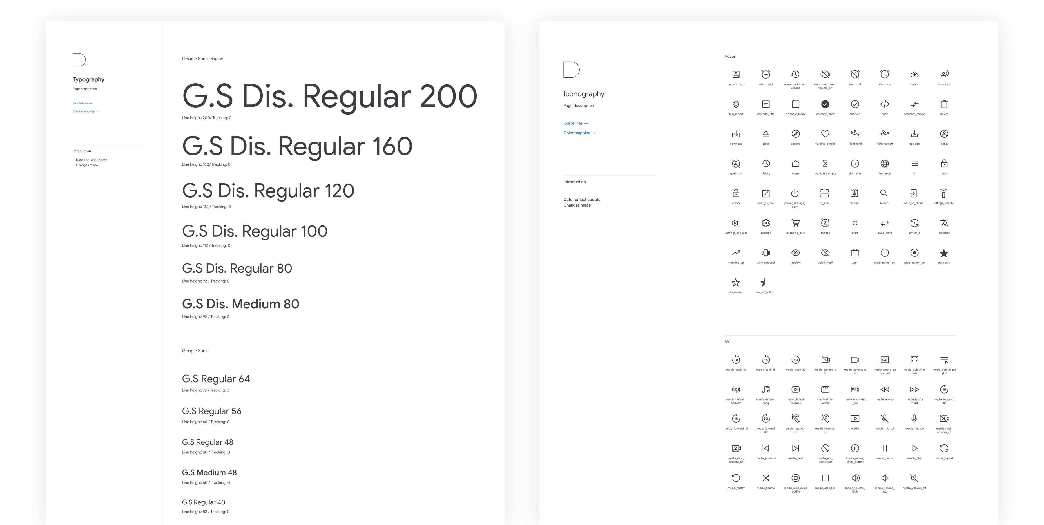
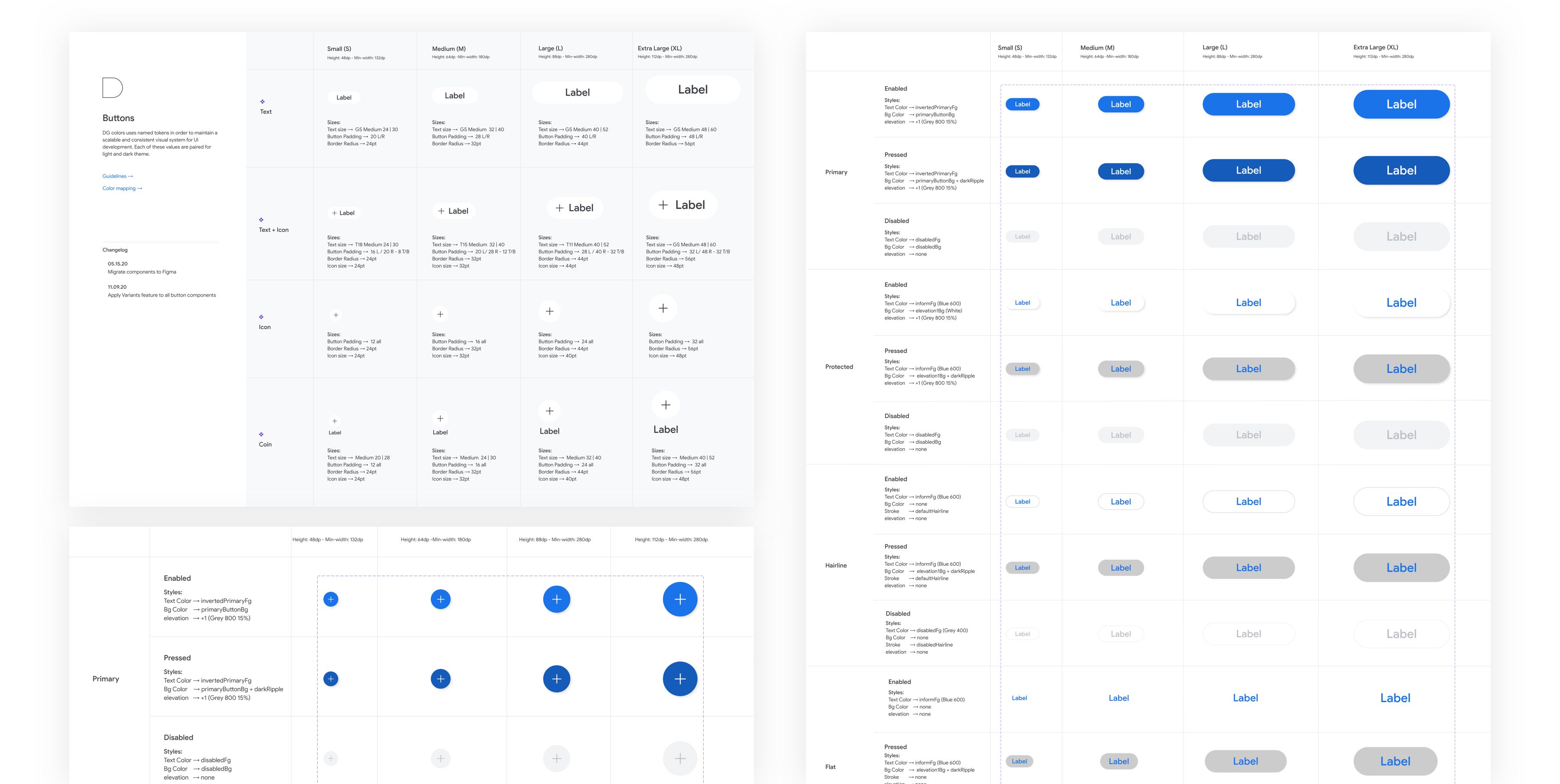
To keep our library organized, whenever we have atoms that are related to bigger structures, we created them as building blocks similar to Google material.
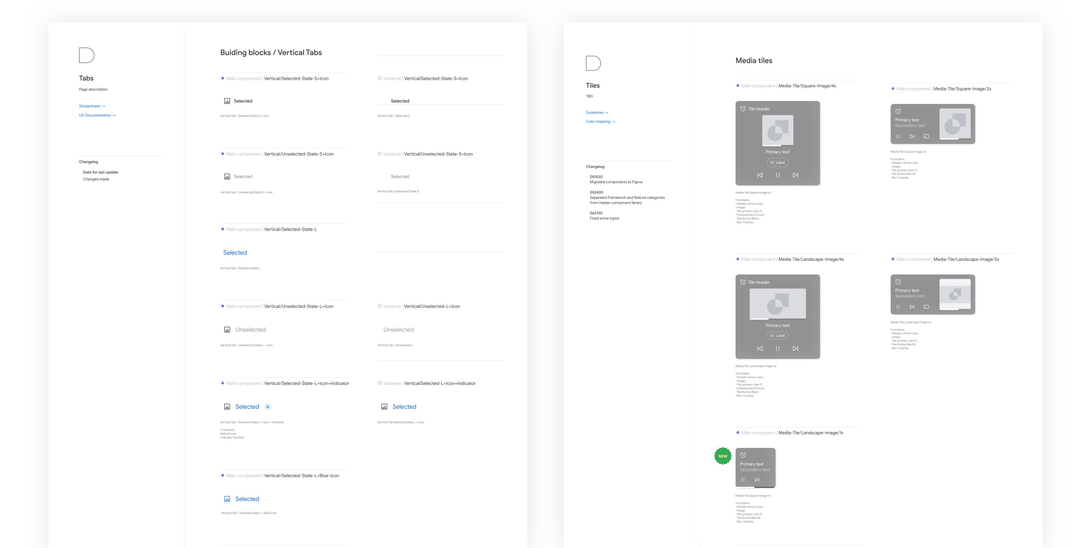
Main components are always layout on the left side and their variations and instances on the right side. The header shows whether it is a main component or an instance.
We created a system where the Assistant Light Theme library is the main library. Dark theme library feeds from Light, and components mimic its changes in structure.