El Tiempo - A New Way to Read the News
EL TIEMPO is the biggest newspaper in Colombia. One of the requests was to change the CMS; we needed to unify feeding and publishing content in a single tool to achieve greater cost efficiency. We needed a tool that was easy to operate and flexible for different platforms. Taking advantage of that, our creative team decided to redesign the digital experience of the web page.
The challenge:
The main goal for this redesign was to give an innovative tool to the journalists and our users; we needed to achieve the goals of both parts by giving them new navigation and interaction to make the page more friendly.
The beginning:
Think of an innovative, personal, and new page to read the news.
The first step was to understand the business's needs and the user's pain points for the whole team. In this way, they could make a clear route map to start.
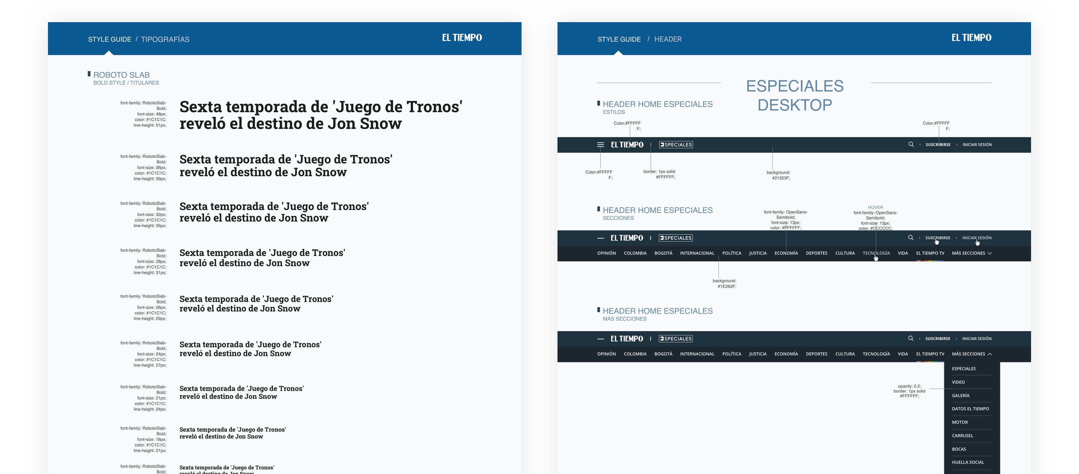
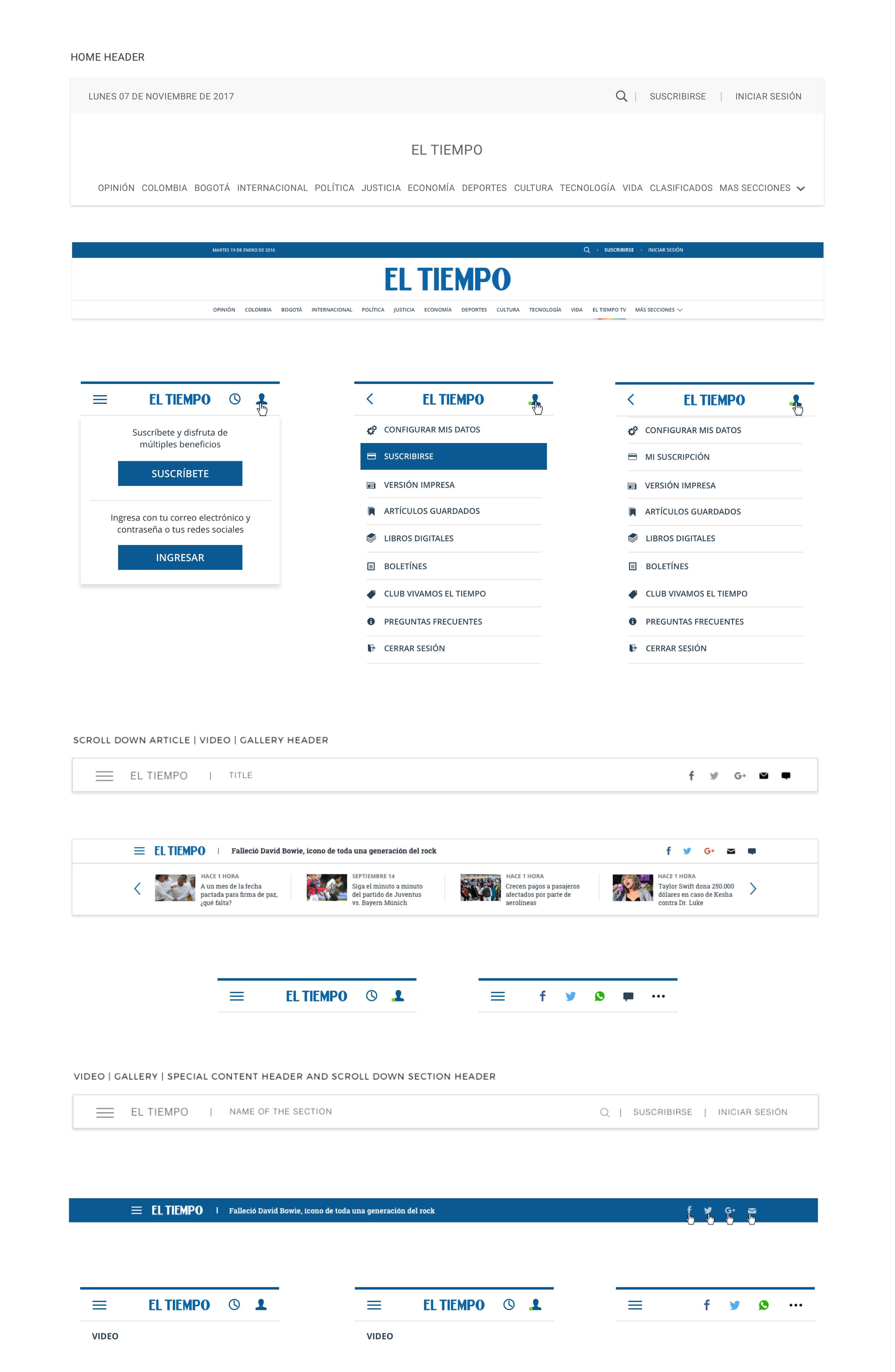
A more understandable header. The most important sections to the newspaper and the users are shown, and the rest are in "more sections" CTA to allow the users to find the entire content.
Organization matters. We wanted the home to be organized by modular segments representing the newspaper's different sections or related topics. We created three different versions of the modular section, giving the newsroom the best way and a better understanding of the user needs.
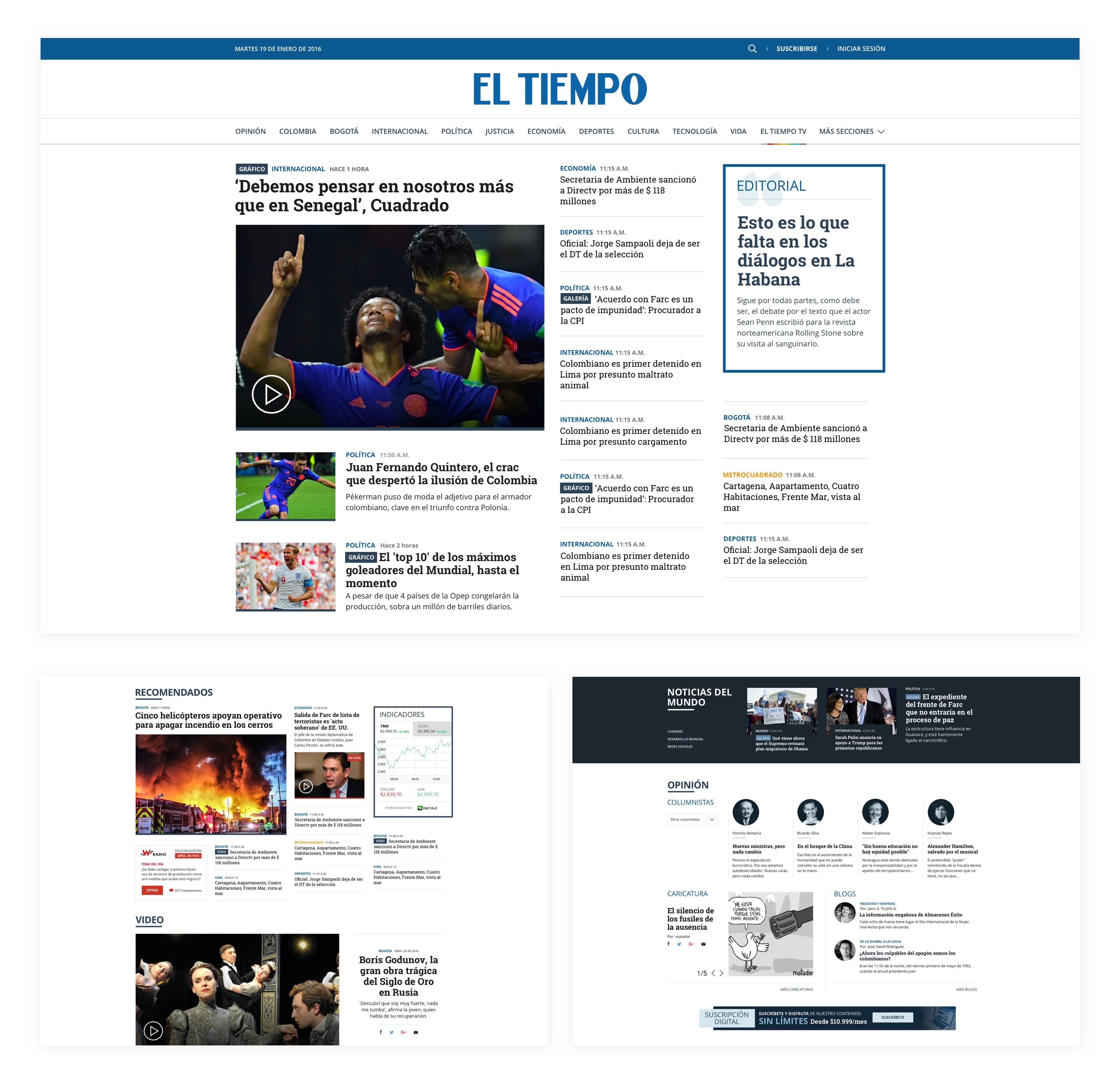
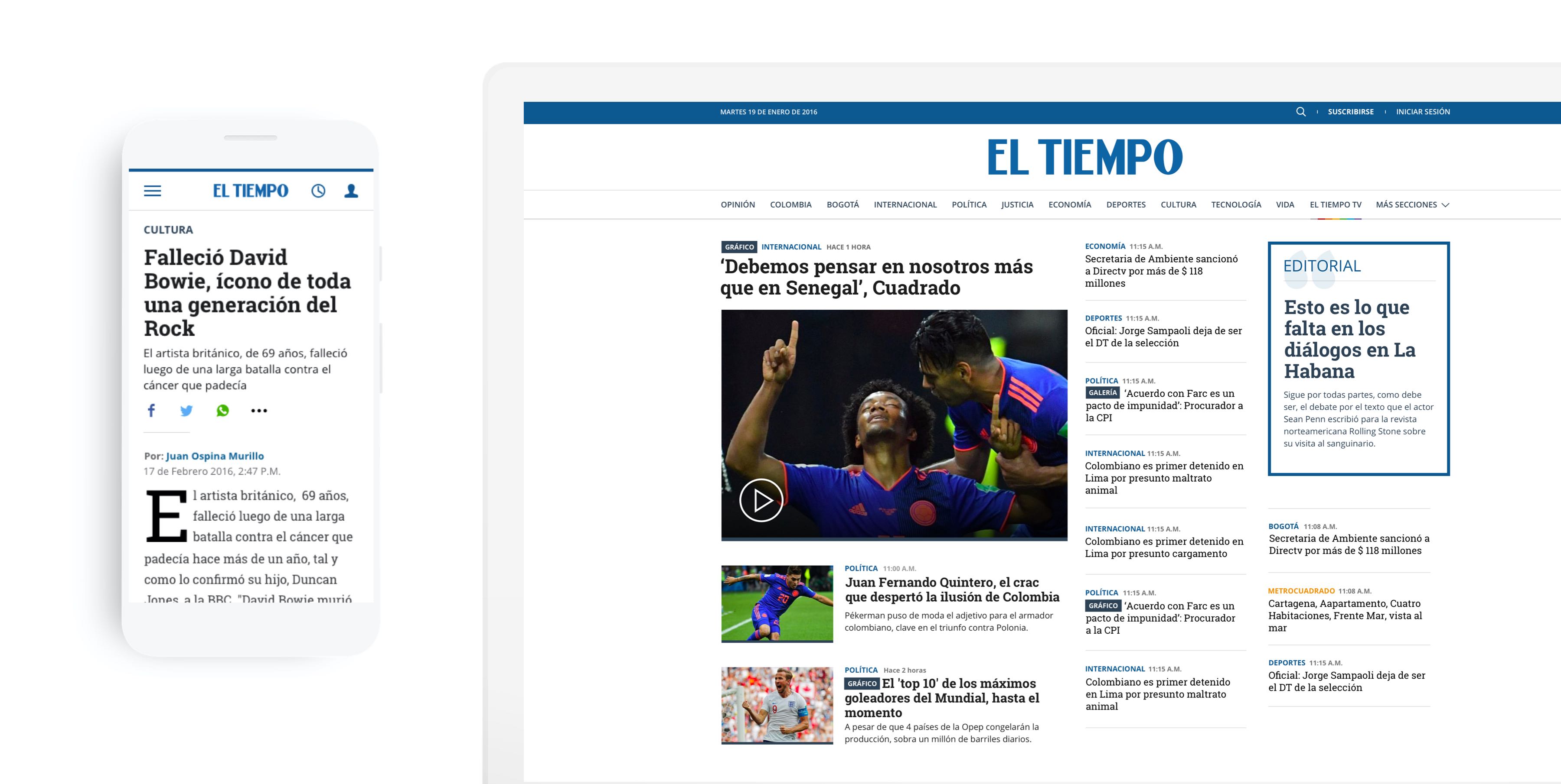
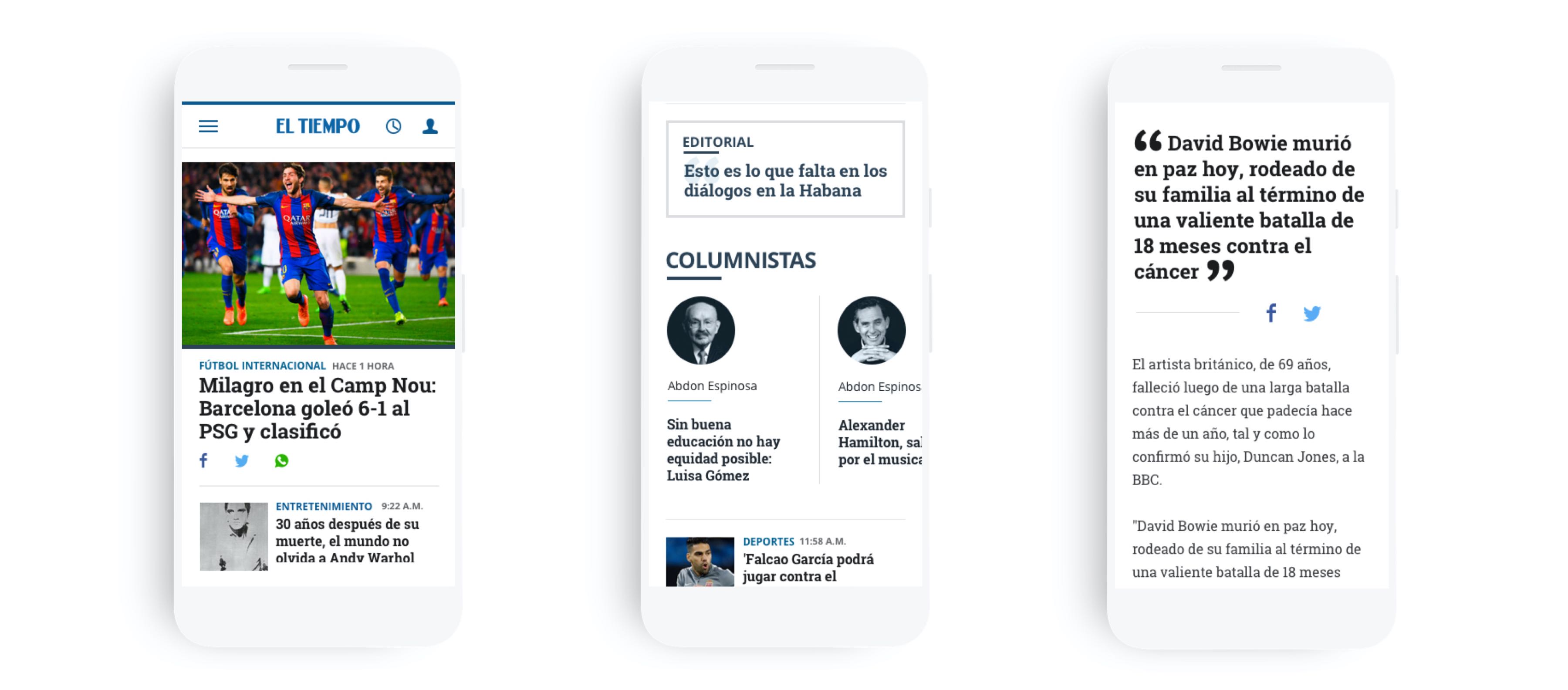
Modules adapted for mobile. Modules such as indicators, articles, video, or gallery have variations to better performance and interaction on mobile devices. Now mobile can work separate from the desktop.
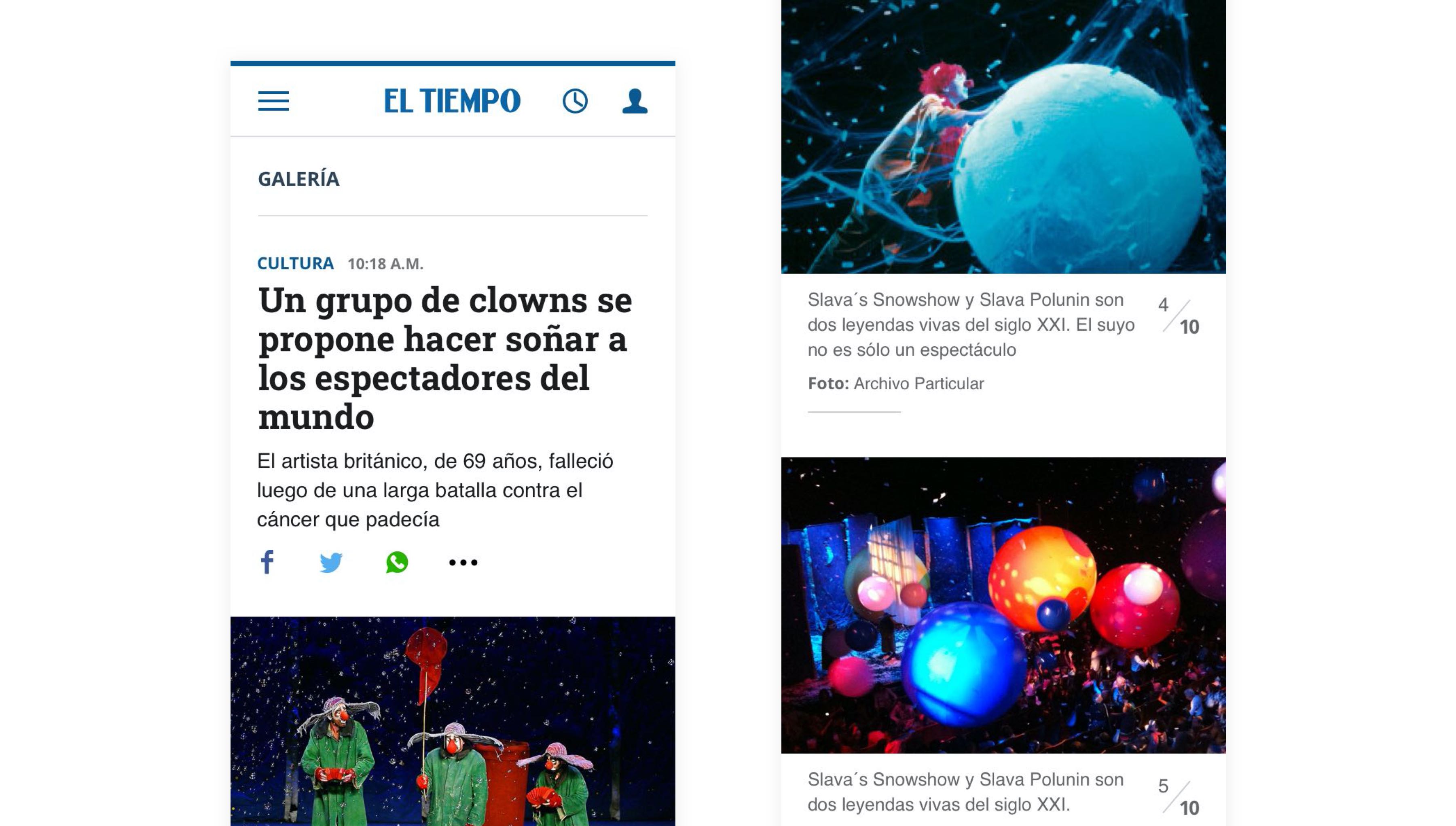
We also have a new way of navigation for the galleries. Now we don't have carousels; instead, we are using vertical gallery navigation that, according to different tests with users, this type of behavior developed it easier to see images.
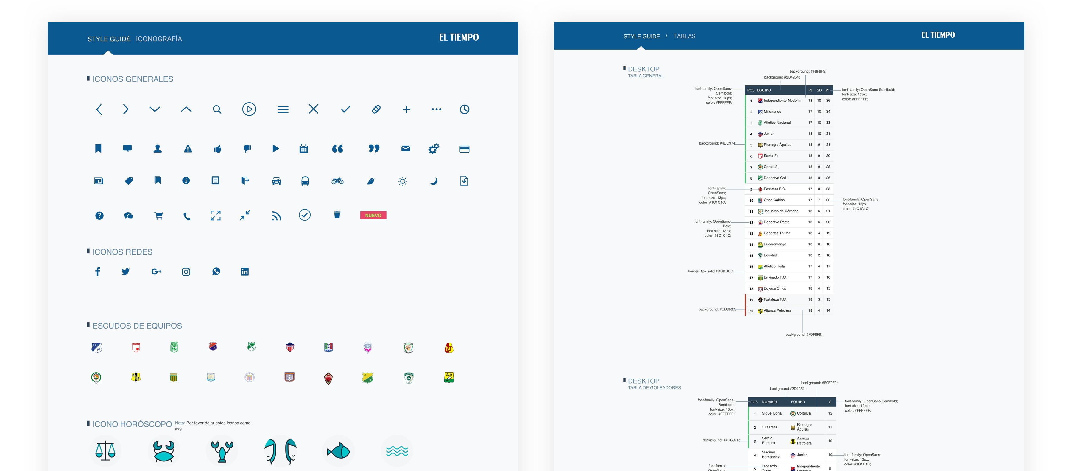
We also created a design system to organize all the components with their specs to improve our hand-off process to the dev and QA team.